Simple enough, right? Do you want to guess how much they paid for it? Possibly millions of Rands. And I will be optimistic and assume that the designers did a lot of research to come up with this simple representation of the company.
I know there will be a lot of criticism and many claiming that it was probably done with Microsoft Paint. That’s totally beside the point. The point is MTN, the client. When MTN looks at this logo, they can see the potential it has, the many ways in which it can be applied to their current services and products, the potential customers it will bring them, and the overall value and the modern message it conveys.
A logo does not have to be complicated to be valuable to the client. It simply needs to convey the message that the client wants to convey to their customers.
COLOURS
You can see that the old logo had more colors and more shapes. My question as a designer is probably the same as yours: will the clients be able to recognize the logo without those colors?
Most likely they will be able to recognize it, I mean the name is still the same. As I understand it, the designers most likely did a lot of research to answer that simple question. And I guess that the answer was yes. Why? Because they deduced that the primary color that clients mostly associate the brand with is the bright, rich yellow that MTN uses. These colors bring certain emotions and have a way that they influence consumer behaviors.
So, maybe after many surveys and analytics reports, they deduced that they would keep the yellow so that they don’t lose the brand completely.
SHAPES
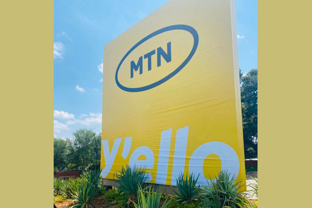
What about the shapes? You will also notice that the new MTN logo kept its oval in which the logotype is font. This is a great rebranding strategy as it still maintains the general idea of the previous logo.
Of course, there is a bit of difference with the new logo because it is just a little bit more orange.
APPLICATION
Have a look at how they are already using this logo, in my opinion, it is quite beautiful and effective.
More examples are the Nike logo, Twitter, Zoom, Microsoft, Vodacom and so many more.
In brief, before you complain about a logo being expensive, think of how much you value the impact it has or will have on your business.
ABOUT THE AUTHOR

Genial Ingele is a business analyst who constantly researches business development and offers solutions to business problems.
He obtained his bachelor’s degree in software development at Monash University, a renowned South African university. In 2021, he studied business management practice (a postgraduate diploma) at the University of Cape Town, the best business school in Africa (according to Top Universities, 2021).
Entrepreneur, Business Analyst, and Marketing Expert